Hmmmm…

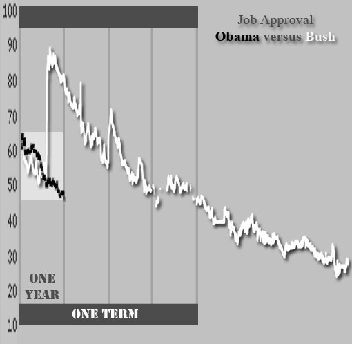
Dawn sent me links to the Real Clear Politics job approval numbers for Bush and Obama to date (thanks Dawn!), and I thought to myself, “self — I’d really like to see those two line graphs superimposed.”
Being a profoundly lazy woman who no longer owns graphing software, I didn’t go back and replot them from the original data. I just took the two images, knocked out the disapproval line, superimposed them and — using the magic of Photoshop — tugged and squeezed until all the axes aligned. That’s why the lines look funky and chewed. They are reasonably accurate, though.
I don’t think there’s a profound idea to be taken away from this. We’ll never know what Bush’s presidency would have been like without September 11 erupting early on. Or whether he’d have won a second term. I’m not even sure we can read anything into the apparent volatility of Bush’s numbers (that’s probably an artifact of the squashing and stretching I had to do).
Still, that trend can’t make Obama’s political folk happy. When you run as all things to all men and turn out to be not much for not many, the public disillusionment is profound. And disillusionment is a sausage machine: you can’t turn the handle the other way and get your pig back.
Oh, and not a WORD about the line colors, okay? This is a monochrome blog; I’ve got two dramatic choices and I thought the fatter line should be the lighter color. Then I got all through and went, “oh, fuck.”
I hate that I have to think about these things.
January 13, 2010 — 6:02 pm
Comments: 30


