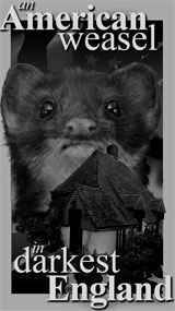


Wrong tree. Am I barking up one?

I’ve had requests to put poor old Zombie Reagan on stuff since I first posted him. Sadly, the original drawing is quite small. It would come out about an inch and a half wide printed at 300 dpi.
I have serious finaldraftophobia. If I’m too pleased with a rough idea, I will always fumble the final, for-reals version. So, rather than trying to redraw this illustration, I thought I’d try going back to the official portrait and do a Photoshop job. Fortunately, the photo is available quite large, and I doubt there are any copyright issues with presidential portraits.
The question is, is this creepier than it is funny? I can’t make up my mind. I haven’t invested a whole lot of time in it yet, and before I labor to overlay cobwebs and strings of executive beef jerky, I’d like a second opinion or ten.
You know that “line” people talk about? I can never see the damned thing for myself.
Posted: October 19th, 2009 under artwork, personal, photoshop, politics, zombie reagan.
Comments: 41
Comments
Comment from BuckNutty
Time: October 19, 2009, 6:45 pm
Too realistic. Much creepier then the origional – and kind of sad. The origional was like a comic, this one screams “Reagan is DEAD”.
That’s my 2 cents.
Comment from S. Weasel
Time: October 19, 2009, 6:50 pm
I’m inclined to agree. And yet…
Comment from BuckNutty
Time: October 19, 2009, 6:54 pm
The right side of his face is too photo-realistic.
Comment from BuckNutty
Time: October 19, 2009, 6:55 pm
love the hair though
Comment from Alice H
Time: October 19, 2009, 7:07 pm
Yeah, I think it needs to be more comicky. But not comic sansy, you know how I feel about Comic Sans.
Comment from Janna
Time: October 19, 2009, 7:12 pm
Sorry, it’s creepier than the original
I miss Reagan and like Bucknutty says, that just reminds me he’s gone.
Reminds me of an art instructor I had…he said art takes two people…one to draw and one to slap his hands and tell him he’s finished.
Comment from S. Weasel
Time: October 19, 2009, 7:16 pm
Heh, Alice. To answer your question, any font with a Wild West flavor is worse than Comic Sans. My boss, who was a font snob, had a particular hate on for…Babyfat Bold, I think it was.
In color:

Comment from Scubafreak
Time: October 19, 2009, 7:30 pm
Creepy. The Cartoon version is much less unsettling…
Of course, we ARE coming up on All Hallows Eve….
Comment from Pupster
Time: October 19, 2009, 7:47 pm
I dunno Weasey…I guess you could loosen the jaw a little…I hate to lose the smile but he needs a little less life in the face.
Maybe go with an angrier demeanor:
Comment from See-Dubya
Time: October 19, 2009, 7:58 pm
Suit should be brown. Reagan famously wore a brown suit. It’ll still contrast nicely with the green.
And I agree it’s still too creepy and realistic. People might admire it but you won’t sell as many shirts.
Comment from S. Weasel
Time: October 19, 2009, 8:05 pm

For comparison.
Comment from Chef Mojo
Time: October 19, 2009, 8:18 pm
Close, but no braaaaaiiinnns…
Hair is great. Face too photorealistic. The genius – oh, and make no mistake; it was genius – of the original was its cartoon aspect. I think you need to find a happy medium twixt the two. Loose the green in the color. Or make it less obvious. Corpses don’t turn green. They grow some green, but overall, they just get kinda burnt leathery, or jerky like. Think corpse with a Donatella Versace-at-the-beach look about it. http://tinyurl.com/yhmhetk. That’s zombie skin right there. That’s the look you’re looking for. Brown suit is a must. Very Reagan.
Comment from Allen
Time: October 19, 2009, 8:21 pm
I think this is past it’s sell by date. I can’t really say why, but it just doesn’t work for me.
Now however one might do an obverse, such as: Zombie Mao.
Obama,
Leftism,
Mao…
Or, Zombie Che, or Zombie Lenin. Or, just a current pic of Fidel.
Comment from Chef Mojo
Time: October 19, 2009, 8:26 pm
Allen has got a point. However, Zombie Reagan holds a place in many of our hearts, and should be the standard bearer of a whole line of Weasel Ts featuring the visages of dead commies vanquished by the immortal Zombie Reagan! Mao, Che, Lenin, Stalin, et.al., should provide Weasel with hours of Photoshop fun-for-profit during the English winter!
Comment from S. Weasel
Time: October 19, 2009, 8:27 pm
I thought we were coming up on the Age of Zombies.
Beats the shit out of the Age of Aquarius.
Comment from Steve Harkonnen
Time: October 19, 2009, 9:01 pm
I think it’s killer, actually. I hope that Zombie rips out Obama’s eyeballs and eats them right in front of his blind black ass.
Comment from Allen
Time: October 19, 2009, 9:12 pm
Perhaps, Zombie Nobel. In one hand he’s got a stick of dynamite with a burning fuse, in the other a “prize.”
Forgive my pessimism Weasel 🙁
There’s an idea, a set of coffee mugs with the weasel monikers. Happy Weasel, 🙂 Frown Weasel, 🙁 Wink Weasel, 😉 and… well what’s the fourth weasel?
Oooo, a movie idea: “The Fourth Weasel.”
Comment from jwpaine
Time: October 19, 2009, 9:17 pm
Yeah, I’m thinking higher on the creepy scale. I wonder if—like Bucknutty, et al said—a more cartoony (think Cryptkeeper) look would work. You can certainly go farther over the top with a cartoon.
Comment from jwpaine
Time: October 19, 2009, 9:23 pm
…and Weez, the Age of Aquarius was the Age of Zombies. They just all died out because of a braaaaiiiiin shortage.
Comment from See-Dubya
Time: October 19, 2009, 9:36 pm
Peggy Noonan used to make fun of Reagan’s brown suit: http://www.nationalreview.com/interrogatory/interrogatory020602.shtml
Comment from MPFS Indentured Fish Stick to the State
Time: October 19, 2009, 9:38 pm
This new one freaks me out. Too real.
Comment from Alice H
Time: October 19, 2009, 10:00 pm
Congratulations, Stoaty, you’re the only hit on the entire intarwebs for the phrase “babyfat bold”!
Comment from David Gillies
Time: October 19, 2009, 10:15 pm
I vote creepier rather than funny. I just love the original, because it is obviously a drawing.
Comment from Mrs. Peel
Time: October 19, 2009, 10:24 pm
Honestly, I’ve never liked Zombie Reagan. I just don’t like zombies, period. They creep me out. I seem to be in the minority, though.
Comment from Sockless Joe
Time: October 19, 2009, 10:49 pm
I’d vote for something closer to the old version. I wouldn’t go for anything more realistic than 1978 Dawn of the Dead Romero-zombies.
Comment from BrunoBraun
Time: October 19, 2009, 10:58 pm
As is. Great man. Great zombie.
Comment from Lipstick
Time: October 19, 2009, 11:53 pm
What Mrs. Peel said.
Comment from Can’t hark my cry
Time: October 20, 2009, 12:04 am
Hm. Dunno if that disappeared because I screwed up the posting, or if even Akismet couldn’t stomach it. General point was that, if the original is tiny. . .you should do some tiny (pins, earrings, multi-replications on the same mug) reproductions. Save big reproductions for future images (which we all look forward to, and I swear I’ll buy one. Um, yeah, well, I’m sure you’ll produce something a card-carrying ACLUer can wear with a smile, ayup.)
Comment from Can’t hark my cry
Time: October 20, 2009, 12:15 am
(Sorry, brain fizz–I’m leaving tomorrow on a roadtrip and as a result my staidness index is unduly low. . .)
Don’t overlook the possibilities of refrigerator magnets and bookmarks. There are possibilities for a tiny image–and sometimes tiny attracts amazing attention. I have a pair of earrings made for me by a friend from a singe Newcastle Brown Ale bottle cap. . .and every time I wear them people NOTICE them, although they seem to me so unobtrusive. . .and, geez, Zombie Reagan should surely attract at LEAST as much attention. . .
Comment from QuasiModo
Time: October 20, 2009, 2:22 am
Very good p-shopping but too real…needs to be more of a caricature…more comic-book.
Comment from QuasiModo
Time: October 20, 2009, 2:23 am
…like Tales from the Crypt kinda thing…
Comment from weirdsister
Time: October 20, 2009, 2:45 am
Can’t hark my cry is on to something! I think you should make the original Zombie Reagan into campaign buttons.
I prefer the old version of ZR to the new one, for the same reasons that have been posted above. 🙂
Comment from thales
Time: October 20, 2009, 6:10 am
A bit too asymmetrical. Too life-like on his right. I think maybe a little bit more pucker, shrivel, flaking, etc., on his right side, and maybe some bone showing through at the cheekbone or mandible or forehead. But keep the benevolence. Just make it a little more, you know, sardonic.
Comment from Woody
Time: October 20, 2009, 6:38 am
The comic one is better, this one is too real and just makes me sad.
I don’t want to think of him that way. I’d rather remember him smiling and waving to me as his train pulled away from the campaign stop where I first saw him.
Comment from Princess Bernie
Time: October 20, 2009, 8:51 am
I agree that the newer version is too creepy and sad. More cartoonish for me, please.
I also like the Zombie Mao, Zombie Chavez, Zombie Obama, Zombie (insert bad guy’s name here) idea. It could be the battle of the good Zombie vs the evil Zombies.
A whole comic book series!
Comment from S. Weasel
Time: October 20, 2009, 9:29 am
But…but…drawing is hard.
<stuffs hands in pockets, scuffs shoe, wanders off muttering>
Comment from Matt P
Time: October 20, 2009, 10:05 am
The original is just about perfect, so pretty much anything else won’t be as good even if it’s good on its own. Isn’t there some way to embiggen the original from a printout via actual photography without losing resolution? Could you embiggen it via photography and then scan it back in at whatever size you want?
Comment from Jason L
Time: October 20, 2009, 4:51 pm
The cartoonish original is funny, and yet I could still imagine giving him a hug.
This new one is creepy. Ixnay on the ughay. I no likey creepy Reagan.
Maybe make one like that of Roman Polanski…or could he not be any creepier?
Comment from EW1(SG)
Time: October 20, 2009, 11:33 pm
But…but…drawing is hard.
Say, isn’t that why they called it work when you had to get up every day and go to the place where they had the cafeteria and a desk and all and made you draw stuff “for the company?”
Comment from Poindexter
Time: October 21, 2009, 12:29 pm
I like the cartoony-one better, but I’d use the new one as well . . . something to frighten the DU/Kos Kids with for Halloween. ..pointdexter..
Comment from Old Grouch
Time: October 22, 2009, 11:34 am
Try: Posterize the flesh (6 levels?), then brighten it… IMO it’s too dark overall. Maybe reduce the color pallette for the whole image?
I prefer the visible pupil and the light reflection of the (viewer) right eyeball in the original.
Write a comment
Beware: more than one link in a comment is apt to earn you a trip to the spam filter, where you will remain -- cold, frightened and alone -- until I remember to clean the trap. But, hey, without Akismet, we'd be up to our asses in...well, ass porn, mostly.<< carry me back to ol' virginny