









Obsessive
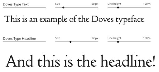
At the turn into the 20th century, a man named TJ Cobden-Sanderson started a publishing house in London. Later, he took on a partner named Emery Walker. It was called the Doves Press. They commissioned a man to create a typeface for them, a complete set in 16 point.
The two had a falling out and in 1909 dissolved the partnership. The font was part of the company assets, but an ongoing legal battle ensued. For several years, Cobden-Sanderson snuck out of a night and threw the hot metal type into the Thames, until he’d disposed of the lot.
It was regarded as a lost typeface.
In modern times, a few letters at a time would wash up on shore to be picked up by mudlarkers (one man found 41 of them after a dry summer and the removal of ‘wet wipe island’ – I did not pursue this story!).
A designer named Robert Green became interested in recreating the font in 2010, which he tried to do from the few printed examples from the Doves Press. Later, he became obsessed with finding the actual hot metal. Using Cobden-Sanderson’s journals and the previous finds, he worked out where he thought they’d gone into the river. He immediately found three at low tide.
The article doesn’t make it clear whether he hired the licensed divers who found the rest, but it was too dangerous on the Thames for amateurs. The pros eventually found 150 more pieces. And with that, he was able to recreate the font.
You can license it here. I don’t love it. I’m not a font snob (I have worked with font snobs; I know the breed). But those off-center dots over the i and the funny diamond-shaped dot on the exclamation point (other punctuation symbols have it, too). It doesn’t do it for me.
p.s. Says Grok: Yes, the dot over the lowercase i (and j) is called a tittle. Derived from the Latin word titulus (meaning inscription or heading), this small diacritic mark serves to distinguish these letters from other vertical strokes, such as the lowercase l or the number 1, ensuring clarity in handwriting and typography. It is an integral part of the glyph’s shape, particularly in condensed scripts like blackletter where its absence could cause significant confusion.
p.p.s. Dead Pool tomorrow!
Posted: September 17th, 2026 under personal.
Comments: 7
Comments
Comment from Uncle AL
Time: September 17, 2026, 9:33 pm
Those off-center dots are as off-putting as calling the dots tittles. It’s just wrong, not quite as wrong as B. Kliban’s Barf Bold, but still wrong.
Comment from QuasiModo
Time: September 17, 2026, 10:04 pm
Agree, those offset dots bother the crap out of me.
Comment from Jasonius
Time: September 18, 2026, 5:31 am
Well the dots had to be called something. I think the cross on the T is called a jot. So the saying “every jot and tittle” which is so silly it has to be a British-ism directly maps to “crossing all your t’s and dotting all your eyes” in ‘Murican. Personally I like the former, it sounds more refined and I get to nearly say a racy word in polite company.
Comment from Jasonius
Time: September 18, 2026, 5:33 am
And now that Stoaty pointed it out, I can’t unsee the wonky tittle. So, no Dove typeface for me.
Comment from ExpressoBold Pureblood
Time: September 18, 2026, 12:36 pm
Whoa!
That license link is all kinds of non-html:
“http://Cobden-Sanderson’s published journals”
Comment from aelf
Time: September 18, 2026, 3:16 pm
Kind of like the font but can’t think of any use I might have worth £40.
Comment from S. Weasel
Time: September 18, 2026, 3:45 pm
That’s the standard cost of licensing a copyrighted font. That’s why the big fonts have so many free imitation ones.
We used to license Adobe fonts at work.
Write a comment
Beware: more than one link in a comment is apt to earn you a trip to the spam filter, where you will remain -- cold, frightened and alone -- until I remember to clean the trap. But, hey, without Akismet, we'd be up to our asses in...well, ass porn, mostly.<< carry me back to ol' virginny