If the science were real, they wouldn’t have to be so tricksy
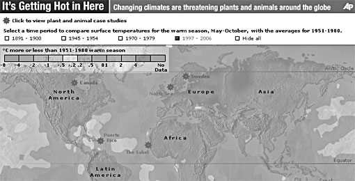
The Associate Press published this interactive map today. You click the little buttons at the top, and you get to see the map turn from cool blues and grays to scary-hot oranges and yellows as average global temperatures get warmer.
Then I read the key.
They are comparing warm seasons (May to October) of four recent periods (1891-1900 to 1945-1954 to 1970-1979 to 1997-2006) to the averages for 1951-1980. Prithee, allow me to inquire — what the fuckity fuck? Here that is on the calendar:

Why those four particular nine-year clusters? And why compare them against that particular overlapping 29 year stretch? And why just the warm seasons? They don’t explain, but we suspect we know why, don’t us?
Comparing four random chunks of time to another random chunk of time may make for a colorful, scary-looking picture, but it sure as shit isn’t science, folks.
But wait! There’s more! Remember our old friend the Greenland ice cores from a while back? Taking the earliest period versus the latest period on their map, this is what their cunning stunt looks like plotted on that:
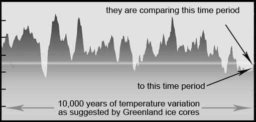
Pff! Lovely settled science there, guys.
Oh, and the little stars on the map? You’re supposed to click them — all six of them — to learn what adorable, doe-eye animals are endangered by this obvious runaway warmening. Click the star for Sweden and you discover that climate change means filthy, disease-carrying ticks can survive there now.
So it’s getting warmer in Sweden, and the most striking consequence of that is…ticks!?!
December 22, 2009 — 7:47 pm
Comments: 12

